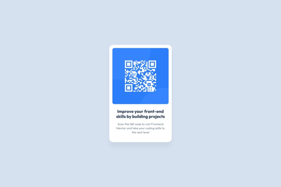
Design comparison
Community feedback
- @vlrnsnkPosted 3 months ago
Hello there 👋. Good job on completing the challenge !
You’ve done a great job with the layout using Flexbox and matching the colors closely to the design. To improve the solution further, here are a few suggestions:
Dimensions: The width and height seem a bit off. This might be due to using rem for dimensions. For more precise control, especially with design challenges, sticking to px for dimensions can be more reliable.
Typography: The font should be set to Outfit instead of Roboto, as specified in the design. Additionally, increasing the font sizes would better match the intended look and improve readability.
Semantics: Consider using a visually hidden h1 for accessibility, with the h2 inside the card itself. This approach maintains semantic structure while keeping the design intact.
Overall, you’ve done a solid job, especially with the layout. These adjustments will help refine the solution even further!
I hope you find it useful! 😄 Above all, the solution you submitted is great!
Happy coding!
0
Please log in to post a comment
Log in with GitHubJoin our Discord community
Join thousands of Frontend Mentor community members taking the challenges, sharing resources, helping each other, and chatting about all things front-end!
Join our Discord
