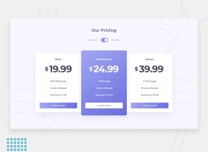
Design comparison
SolutionDesign
Solution retrospective
Are there any suggestions for improving the way I have written the BEM?
Community feedback
- @fraserwatPosted almost 3 years ago
Hey Jerome, this is looking nice!!
Few suggestions:
- Check out the font on the spec / readme, I think you're using a different one to the design
- Take a look at the <span> documentation https://developer.mozilla.org/en-US/docs/Web/HTML/Element/span. Generally you use this for emphasising text (e.g. making a single word in a <p>tag<p> a different colour), or applying a different style to specific headers/paragraphs. You probably want to replace most of your span tags with a different html element.
BEM stuff all seems to be in order, and your toggle is really smooth.
Keep up the good work, its looking great!!
Fraser
Marked as helpful0
Please log in to post a comment
Log in with GitHubJoin our Discord community
Join thousands of Frontend Mentor community members taking the challenges, sharing resources, helping each other, and chatting about all things front-end!
Join our Discord
