

Design comparison

Solution retrospective
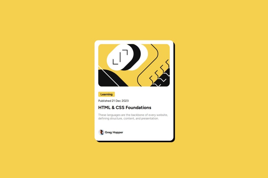
i encountered challenge with giving shadow but on learning how shadow attributes works,i was ablt to pull it off
Community feedback
- @Blurryface1998Posted 8 months ago
Hello, it looks great it has a couple of mistakes you can easily correct so it would be more responsive. In your div container add when in mobile viewport that it has a little margin on the left and right (I think its 24). Also, instead of giving every element in div container a margin, you can add a row-gap when using display flex. That also applies to div contentContainer. I think you forgot to add active states on hover and change the font-size in mobile viewport. You can check my solution if you need any help.
0

Please log in to post a comment
Log in with GitHubJoin our Discord community
Join thousands of Frontend Mentor community members taking the challenges, sharing resources, helping each other, and chatting about all things front-end!
Join our Discord