Design comparison
SolutionDesign
Solution retrospective
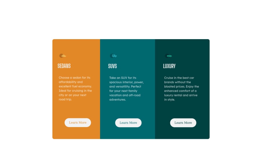
My styling of the buttons gets wierd on tablet view. What can I do to remedy this ?
Community feedback
- @Rafi8811Posted over 3 years ago
you should give all three .card-centent width of 33.3333333333% and on your .btn you should add display: flex; justify-content: center; align-items: center; width:50%; margin: 0px auto; also change the margin-left&right to 10% from 20%
this should fix it somewhat you should also add 100% width to your .card-content at max-width of 600px.
You can also check my sollution for this it might help but its very messy
0@LeskimPosted over 3 years ago@Rafi8811 Thanks much appreciated .....did that somehow 😉 and the buttons are looking good👊🏾
0
Please log in to post a comment
Log in with GitHubJoin our Discord community
Join thousands of Frontend Mentor community members taking the challenges, sharing resources, helping each other, and chatting about all things front-end!
Join our Discord
