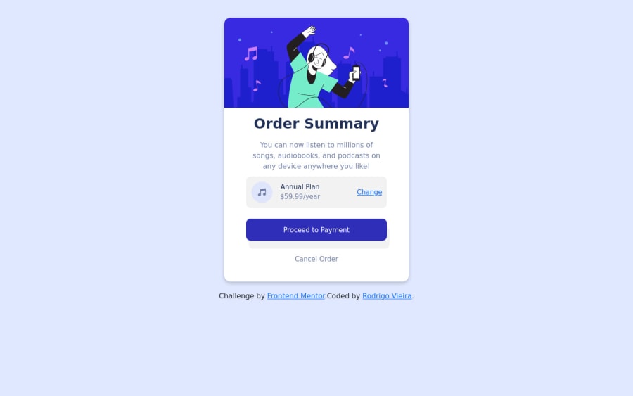
Design comparison
Solution retrospective
I would like to know if the tools that i used are aproppriated, any advice for me is welcome
Community feedback
- @rodrigovnPosted almost 3 years ago
thank you a lot for the feedback, I already adjusted and will definately keep in my notes what you warned me.
0 - @brodiewebdtPosted almost 3 years ago
Hi @rodrigovn, nice job on this card. I have a few suggestions to make it look better and be more accessible. Yo are using a bold tag for the Order Summary text. You don't want to use the bold tag anymore, it has been deprecated. It works, but it isn't really valid HTML. Use an H1 for the Order Summary text. You will have to re-style the text. Every page should have an H1 for accessibility reasons. In the Figma File the box shadow has the following settings: ' box-shadow: 0px 20px 20px hsla(245, 75%, 52%, .2); ` Your box shadow doesn't have a blur which is why it has a hard edge.
Wrap your card div in a Main tag and change the attribution div to a Footer and it will clear the accessibility warnings.
Download AXE DevTools and you can clear accessibility warnings while you code. https://www.deque.com/axe/devtools/
Hope this helps.
0
Please log in to post a comment
Log in with GitHubJoin our Discord community
Join thousands of Frontend Mentor community members taking the challenges, sharing resources, helping each other, and chatting about all things front-end!
Join our Discord