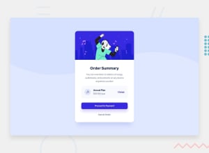
Design comparison
SolutionDesign
Solution retrospective
Any idea or suggestion is welcome.
Community feedback
- Account deleted
Yeah, I also think you might have missed the font, also the background is missing that curvy action.
keep coding👍.
Marked as helpful1 - @ZenCode95Posted about 3 years ago
Hey there, this looks pretty good so far. If I could offer a couple of suggestions:
- the order summary card original template is pretty generous with its width, so you might consider increasing the width on yours for a closer resemblance.
- the challenge includes a specific font to be used in the documentation (check the 'style-guide.md' file in the starter files) I recommend using the required font to achieve a closer resemblance.
Other than that, it looks good! Best of luck to you.
Marked as helpful0
Please log in to post a comment
Log in with GitHubJoin our Discord community
Join thousands of Frontend Mentor community members taking the challenges, sharing resources, helping each other, and chatting about all things front-end!
Join our Discord
