Design comparison
Solution retrospective
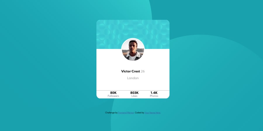
Hello, I am new to CSS and HTML and this is my first challenge, i didn't manage to make the background responsive and the center of the card is for some reason to big. A feedback would really help me to learn from my mistakes 🙏 . Many thanks!
Community feedback
- @SzymonRojekPosted almost 4 years ago
Hi Filip,
Welcome here! Well done, first challenge nearly behind you! :D
I have checked your HTML structure, a few tips from me:
- I'd recommend reading more about the semantic tags and alt text. You don't need to use words like picture or image, photo, icons in the alt text as it's already announced as being an image. You can easily type the name "Victor";
- a few times you have used the span tag. IMO SPAN (and DIV) elements by themselves are generally considered to be semantically neutral. A good approach is to use semantic markup as much as appropriately possible, it all depends on the context (of course, I use the span but before it, I try to think about the other semantic tags). In your project, I'd recommend using paragraph for => followers, likes, photos.
- the circles are a bit tricky in this challenge: I have used pseudo-elements, position absolute, vw and vh, background url, transform translate and @media;
- the section class="card-footer" is not displaying on the screen;
- after :hover, the box-shadow is too strong and you can add nice smooth transition;
If you want to learn about Responsive Web Design (RWD), I can recommend Flexbox & Grid courses made by Wes Bos, they are for free:
Finally, congrats! ** Please, don't forget to upvote any comments on here that you find helpful. That's it from me. Hopefully, it will help you.
Greetings :D
2
Please log in to post a comment
Log in with GitHubJoin our Discord community
Join thousands of Frontend Mentor community members taking the challenges, sharing resources, helping each other, and chatting about all things front-end!
Join our Discord
