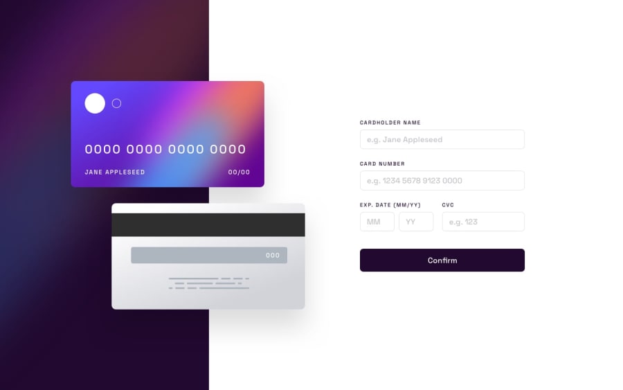
💳 Animated Interactive Card with validation using Vanilla JS
Design comparison
Solution retrospective
Here's my Interactive Credit Card challenge and yes... it was challenging 😅
I started using absolute positioning for the cards and of course this ended up being a bad idea for a responsive website and (of course) flexbox and grid made everything to work and respond to smaller screens (lots of divs required).
I tried to incorporate as many validation and restrictions I could think in the form using JavaScript, and also added a Major Industry Identifier for major credit card networks. If you feel like it, I encourage you to play around to see it working and maybe to spot some unoticed bug? 😬
My question for this challenge Does anyone knows how to acchieve that rounded border with gradiend for input:focus?
Any suggestion of how I can improve my project will be appreciated! Thanks in advance 🌻
Community feedback
Please log in to post a comment
Log in with GitHubJoin our Discord community
Join thousands of Frontend Mentor community members taking the challenges, sharing resources, helping each other, and chatting about all things front-end!
Join our Discord
