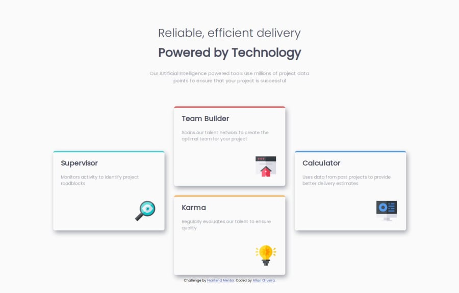


Design comparison

Community feedback
- @KristinaHorbenkoPosted 6 months ago
This is a very interesting solution for card placement. The chosen grid and responsiveness add structure to the design and make it user-friendly across different devices. However, it's worth paying attention to the fixed margins for images. In the CSS, the fixed margins for images (margin: 25px 0 0 200px; and margin: 30px 0 0 232px;) can cause issues with responsiveness. It would be better to use flexible values like percentages or rem for smoother scaling across various devices. Unoptimized CSS: There are many repeated styles for the article element. For instance, width, height, border-radius, and padding-left could be placed in a common class for all articles, which would reduce the code volume and make it easier to maintain. Lack of color variables: Color values (hsl(...)) are repeated multiple times in the code. Using CSS variables for colors would make it easier to change the color scheme in the future.
Marked as helpful0 - @collins-aiPosted 6 months ago
Congratulations on your solution, the solution is looking almost like the original design. Semantic html like header and footer are present in your code which is very nice. The accessibility of the solution is also very good. Concerning the layout it looks ok in different screen sizes but in smaller laptops it doesn't fit properly.
0 - @manuel360Posted 6 months ago
Great layout cheers 🥂 my only problem was the box shadow it was only at the bottom of the card but apart from that 👌
0


Please log in to post a comment
Log in with GitHub
Join our Discord community
Join thousands of Frontend Mentor community members taking the challenges, sharing resources, helping each other, and chatting about all things front-end!
Join our Discord