Not Found
Not Found
Not Found
Not Found
Not Found
Not Found
Not Found
Not Found
Not Found
Not Found
Not Found
Not Found
Not Found
Not Found
Not Found
Not Found
Not Found
Not Found
Not Found
Request failed with status code 502

Submitted

Card Feature Section

@Shikamaru007

Desktop design screenshot for the Four card feature section coding challenge

This is a solution for...

  • HTML
  • CSS
1newbie
View challenge

Design comparison


SolutionDesign

Solution retrospective


What challenges did you encounter, and how did you overcome them?

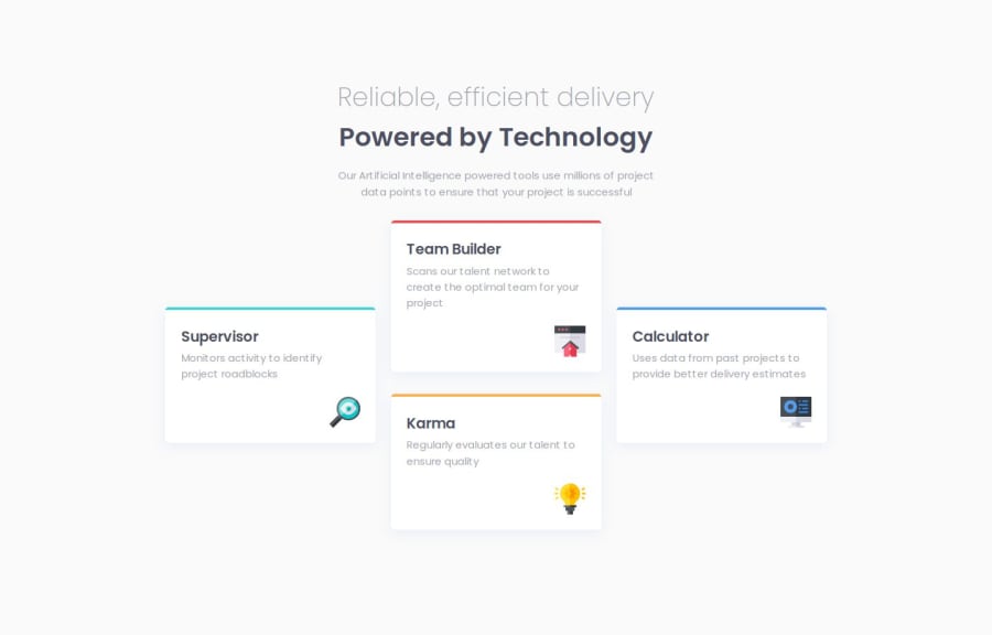
the layout in the center at large screen. its complicated and im not really sure this is best approach for it.

What specific areas of your project would you like help with?

id like to know best approach to get the boxes set properly

Community feedback

MikDra1 6,090

@MikDra1

Posted

Nice one 😀

If you are curious how you can do this straight lines on the top of each card here is my tip:

Create another element in each of the cards. Then position this element absolute. Card should be positioned relative. At the end you need to give this element a height of 3px width of 100% and top 0 and left 0. You can also use ::after or ::before pseudo elements to create these.

Hope you found this comment helpful 💗

Good job and keep going 😁😊😉

Marked as helpful

1

@Shikamaru007

Posted

ohhhh. thats it!. i ended up using top border but i had to reduce the border-radius because the border was curved as well. thanks for this. @MikDra1

0
MikDra1 6,090

@MikDra1

Posted

@Shikamaru007

I'm happy I could help 😁

0
P
Steven Stroud 4,120

@Stroudy

Posted

Amazing job with this! You’re making fantastic progress. Here are some small tweaks that might take your solution to the next level…

  • This should also be in rem .container { max-width: 320px; },

  • Using a <main> tag inside the <body> of your HTML is a best practice because it clearly identifies the main content of your page. This helps with accessibility and improves how search engines understand your content.

  • Your heading elements are <h1><h3><h3> Missing <h2>, Heading elements should be in sequentially-descending order (e.g., <h1>, <h2>, <h3>) to create a clear content structure, improving accessibility and SEO. Skipping levels or using them out of order can confuse screen readers, affect search engine rankings, and make your content harder to understand.

  • Avoid using id selectors for styling in CSS because they are too specific and hard to override, making your styles less flexible and maintainable. Instead, use class selectors (.), which are reusable and more manageable, allowing for better control over your styles and easier updates.

You’re doing fantastic! I hope these tips help you as you continue your coding journey. Stay curious and keep experimenting—every challenge is an opportunity to learn. Have fun, and keep coding with confidence! 🌟

Marked as helpful

1

@Shikamaru007

Posted

Thank you so much, this is really helpful. ill make sure to keep this in mind as i do more. @Stroudy

1

Please log in to post a comment

Log in with GitHub
Discord logo

Join our Discord community

Join thousands of Frontend Mentor community members taking the challenges, sharing resources, helping each other, and chatting about all things front-end!

Join our Discord