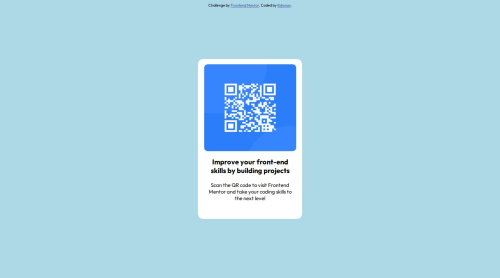
Submitted over 1 year agoA solution to the QR code component challenge
Card element positions with flexbox
@BDWNAV

Solution retrospective
What are you most proud of, and what would you do differently next time?
I am most proud of how the card turned out I know it isn't exactly the same thing but it looks similar to the original image.
What challenges did you encounter, and how did you overcome them?I wasn't sure how to position elements in the card, but then tried to find an alternative solution which lead me to flexbox.
What specific areas of your project would you like help with?Just how I could get the positioning to be better, as I feel like I struggle with positioning elements and need to get better at it.
Code
Loading...
Please log in to post a comment
Log in with GitHubCommunity feedback
No feedback yet. Be the first to give feedback on BDWNAV's solution.
Join our Discord community
Join thousands of Frontend Mentor community members taking the challenges, sharing resources, helping each other, and chatting about all things front-end!
Join our Discord