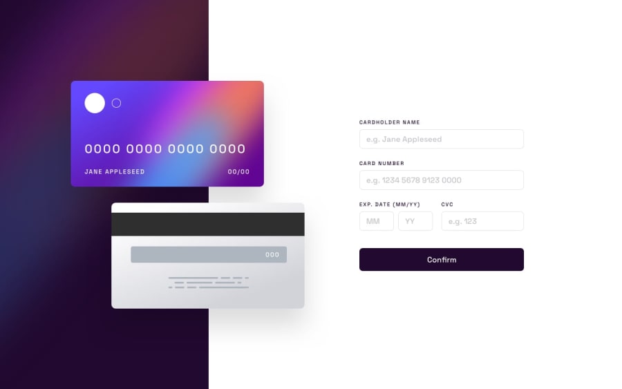
Design comparison
SolutionDesign
Solution retrospective
If you need a test card number to try on the page, 5105105105105100 should work.
My largest issue on this project is with the CSS. There's a lot of screen sizes where things aren't quite right, and some values are hard coded which probably should not be. Any feedback on fixing CSS issues would be greatly appreciated! Also if you find any bugs with the form itself I'd love to know.
Community feedback
Please log in to post a comment
Log in with GitHubJoin our Discord community
Join thousands of Frontend Mentor community members taking the challenges, sharing resources, helping each other, and chatting about all things front-end!
Join our Discord
