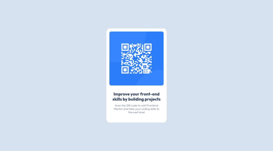
Design comparison
Solution retrospective
This is the first time I have tried.
I was not sure which unit of measure to use for styling. I thought "px" would be easiest, but it didn't seem responsive enough.
I could not automatically center the box at the top and bottom. I set margin-top but it might be unbalanced on some devices. I would like to know a better way.
Community feedback
- @JordanKisielPosted about 2 years ago
What units to use in what situation really depends on what you want to do with a given design. However, pixels should be avoided in most situations except for cases where you don't want to resize something (for instance, border-sizes). That being said, I found this video to be very helpful:
Are you using the right CSS units?
For your second question I would make the body element into a flexbox and extend it the full height of the window like so:
body{
    display: flex;
    justify-content: center;
    align-items: center;
    height: 100vh;
}
You'll also need to remove the margin-top (or set it to 0) on the .card class.
Marked as helpful2@mays21Posted about 2 years ago@JordanKisiel Hi Jordan, thank you for your useful feedback. I set the properties in the CSS and now the box is centered! Also, the video "Are You using the right CSS units?" was very clear. I have successfully completed the design. Thank you so much ❤
0 - @elaineleungPosted about 2 years ago
Hi May, welcome to the Frontend Mentor community, and great job in completing your very first challenge! 😊
I think @JordanKisiel gave you some excellent advice, especially the link to Kevin Powell's explanation on which units to do, so do be sure to have a look at that when you can. There are times when you may want to use pixels, but for the majority of the time I think relative units are the best choice.
As for feedback on your work, I really think you did many things well here for your first challenge, and the only two suggestions I have are (1) change the first
divtomainto take care of the landmark issue in your report, and (2) add amargin: 1remto your.cardso that there's some spacing around the card when the browser size gets smaller. I tried adding the margin via the inspector, and then I see that you got someimportanttags on the margin property. I would say try not to use important tags if you can help it, and in fact, whenever possible, try to avoid using them. If you find yourself needing to use them, then actually what you need to do is figure out which property or rule is cause the declaration to not work as expected.Hope some of this can help you out, and keep going, you're doing great!
Marked as helpful1@mays21Posted about 2 years ago@elaineleung Hi Elaine, thanks for the advice.
I didn't realize that by using mx-auto, the "important" was set and the margin could not be changed. Removing mx-auto made the code better and more concise.
It was a grate challenge for me. Thank you so much!!!
0
Please log in to post a comment
Log in with GitHubJoin our Discord community
Join thousands of Frontend Mentor community members taking the challenges, sharing resources, helping each other, and chatting about all things front-end!
Join our Discord
