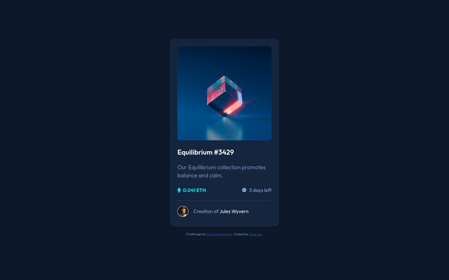
Design comparison
Solution retrospective
This simple card component was a lot more challenging than it looked. One thing I struggled with the most in this project was organizing my stylesheet. I find myself going back and forth between my codes and mock-ups, thinking I have finished only to realize I have missed some essential styling components. Ultimately, this disorganization has affected my workflow and quality of work.
Questions:
- What are the standards or best practices when it comes to organizing CSS and making it more manageable?
- How can I reduce repetition in my CSS?
Community feedback
- @MaryahceePosted over 2 years ago
To avoid repetition in CSS I use class with same name when there are several elements that need same styling design. Also breakdown sections if it's Navbar section check to see what elements have similar design and give them same class name.
Finish designing one section at a time it makes the work easier and you won't have to keep repeating your self. Cheers! Keep coding!
1 - @MaryahceePosted over 2 years ago
Hi the card looks good. At first someone struggles with finding the best working flow. However I have some tips that have helped me become organized while working on my projects. First look and analyize the design and make a sketch of how I will approach the design. Second write down all sections (eg. Navbar, Main, footer.) in the design and what I will use (eg flex or grid) to make them. If you do this routine in your first projects you will notice that in the future you won't necessarily have to do it it comes naturally with more practice. I hope this helps. Happy coding!
1
Please log in to post a comment
Log in with GitHubJoin our Discord community
Join thousands of Frontend Mentor community members taking the challenges, sharing resources, helping each other, and chatting about all things front-end!
Join our Discord
