Submitted over 2 years ago
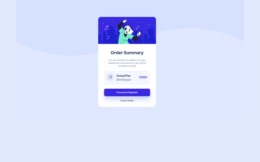
Card component with hover states built with HTML, CSS and Flexbox
@Karlof99
Design comparison
SolutionDesign
Solution retrospective
Some recomendations about RWD?
Community feedback
- @denieldenPosted over 2 years ago
Hi Carlos, I took some time to look at your solution and you did a great job!
Also I have some tips for improving your code:
- Centering a
div
withabsolute
positioning is now deprecated, it uses modern css likeflexbox or grid
- try to use flexbox to the body for center the card. Read here -> best flex guide
- after, add
min-height: 100vh
to body because Flexbox aligns child items to the size of the parent container - For fix the top image in the background just put more specific background properties to the body:
background: url("../img/pattern-background-desktop.svg") no-repeat top center; background-size: contain; background-color: #e0e8ff;
Overall you did well :)
Hope this help and happy coding!
Marked as helpful0@Karlof99Posted over 2 years ago@denielden Hello Deniel: Thank you for your comments. I will work to improve and better understand this challenge. Regards
1 - Centering a
- @SamadeenPosted over 2 years ago
Hey Carlos! Cheers on completing the challenge . Here Are my suggestions .
- You can use the transform property to scale up the card to make it bigger .
- Sections should nest headings and nor the other way around.. . Overall you did very well.. Happy coding!!!
Marked as helpful0@Karlof99Posted over 2 years ago@Samadeen Hello Abdul: Thank you for your comments. I will work to improve and better understand this challenge. Regards
0
Please log in to post a comment
Log in with GitHubJoin our Discord community
Join thousands of Frontend Mentor community members taking the challenges, sharing resources, helping each other, and chatting about all things front-end!
Join our Discord