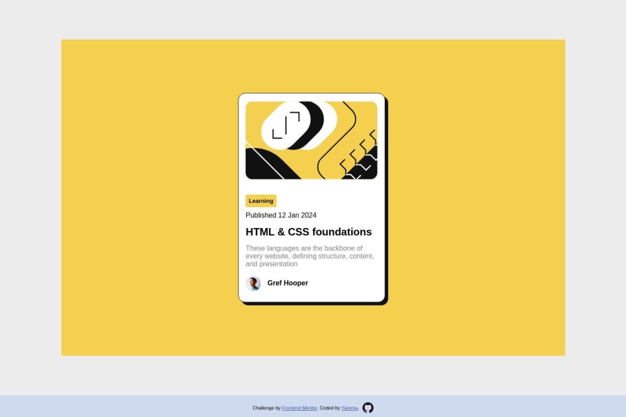
Design comparison
Solution retrospective
Well, flexbox turned out to be much more easier that I thought. At first glance it looks like complete chaos but when you start to understand how it works behind it makes job much simpler. There was one webpage that really helped me to do this task. https://www.joshwcomeau.com/css/interactive-guide-to-flexbox/
Community feedback
- P@danielmrz-devPosted over 1 year ago
Hello @jaremavip3!
Your solution looks great!
I have a couple of suggestions for improvement:
- First: In order to make your HTML code more semantic, use
<h1>for the main title instead ofdiv. Unlike what most people think, it's not just about the size and weight of the text.
📌 The
<h1>to<h6>tags are used to define HTML headings.📌
<h1>defines the most important heading.📌
<h6>defines the least important heading.📌 Only use one
<h1>per page - this should represent the main heading/title for the whole page. And don't skip heading levels - start with<h1>, then use<h2>, and so on.- Second: Still about semantic HTML, replace
div.card-containerwithmain.card-container.
All these tag changes may have little or no visual impact but they make your HTML code more semantic and improve SEO optimization as well as the accessibility of your project.
I hope it helps!
Other than that, great job!
Marked as helpful1@jaremavip3Posted over 1 year ago@danielmrz-dev, Thank you so much for your help. I have discovered Semantics of HTML topic for me. Even thought I knew some separate things, I wasn't confident with them that much. Thanks)
1 - First: In order to make your HTML code more semantic, use
Please log in to post a comment
Log in with GitHubJoin our Discord community
Join thousands of Frontend Mentor community members taking the challenges, sharing resources, helping each other, and chatting about all things front-end!
Join our Discord
