Design comparison
SolutionDesign
Solution retrospective
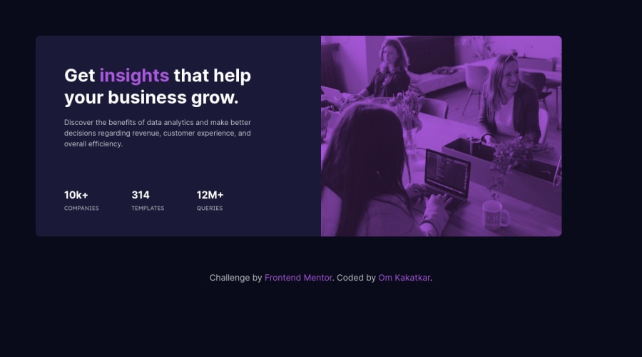
Hello everyone, I've implemented this solution using flexbox. Any feedback, tips and suggestions are much appreciated. My questions are :
- Does the card look fair enough?
- Are the colors, size and spacing is proper?
- Do highlight any discrepancies.
Community feedback
Please log in to post a comment
Log in with GitHubJoin our Discord community
Join thousands of Frontend Mentor community members taking the challenges, sharing resources, helping each other, and chatting about all things front-end!
Join our Discord
