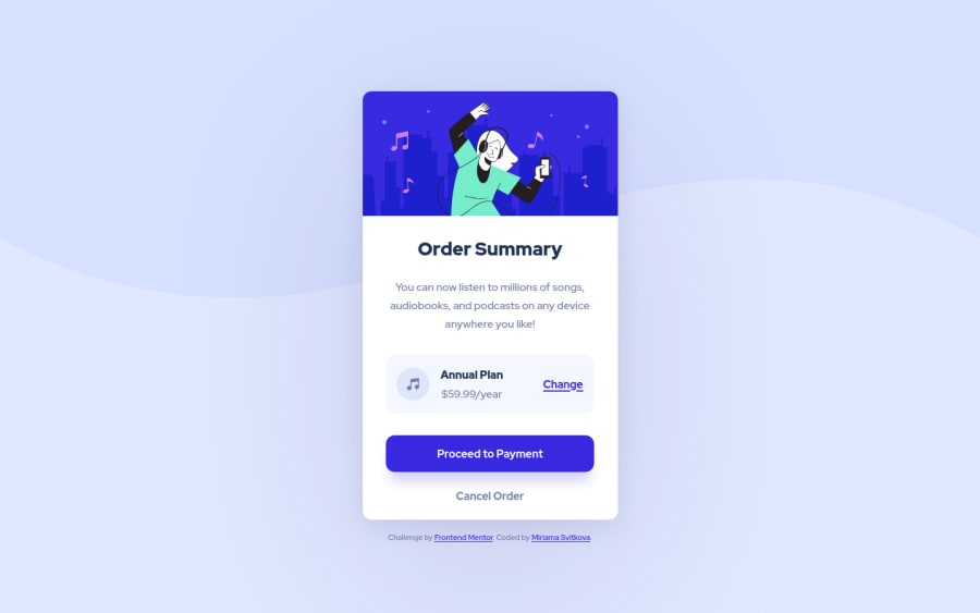
Design comparison
Solution retrospective
My very first project here, I would appreciate your feedback. What I really struggled with - replicating the shadows. Any tips regarding that would be helpful. Thank you :)
Community feedback
- @kens-visualsPosted about 3 years ago
Hey @miri52 👋🏻
I have some feedback for the project and great source for the
box-shadow
s- First, let's fix a couple of other minor things. Hero image should have a
display: block;
, it removes the line underneath the image. If you want to know what's causing it, check out the 3rd section of this video - Next, the music icon. Add
aria-hidden="true”
, because it's for decoration only. You can read more about aria-hidden here. - Check out this link for some cool box shadows.
I hope this was helpful 👨🏻💻 overall, you did a superb job for your first project. Cheers 👾
Marked as helpful0@miri52Posted about 3 years agoHi @kens-visuals :)
Thanks a lot for your feedback!
- I didn't even notice the line underneath the image before because of the white background. But yes, of course it was there! Btw. Kevin Powell is the best. He shares so much CSS wisdom, sometimes it is hard to remember it all :)
- I didn't know anything about aria-hidden = "true" :/ I feel like in general I could improve the accessibility of my projects. If you have any good resources around that, I will be grateful.
- I used the same link to experiment with a few box shadows. My problem was getting the right color. It shouldn't be black but purple and I couldn't do it.
Thanks again for all your tips. I added a section in the readme file of the project called "What I learnt thanks to feedback" and mentioned you there, hope that's ok :)
Cheers!
0@kens-visualsPosted about 3 years ago@miri52 you're welcome 😇
- Ever since I've started doing challenges on here, Kevin has become one of my most watched content creator 😂
- Frankly, I started to learn and practice accessibility recently. I'd suggest MDN docs., at least that's what I reference most of the time, the good thing about it is that you can find ever tying really easily, and they have entire lessons on how to approach accessibility correctly.
- Shadow are the trickiest things to implement, I usually get pretty excited when I manage to implement them "perfectly" 😅, so no pressure on that, especially when you don't have the Figma files.
I'm humbled and grateful, to be able to help and share my knowledge with some beautiful people like you. It's not a problem at all, and I should say thank you for doing that 😇
Marked as helpful0 - First, let's fix a couple of other minor things. Hero image should have a
- @Z-ayatPosted about 3 years ago
You can use these examples https://clipboard-landing-site.vercel.app/ otherwise create a box-shadow:1px 1px 1px 1px #eee; and edit it with chrome dev tools till u get the desired shadow
0
Please log in to post a comment
Log in with GitHubJoin our Discord community
Join thousands of Frontend Mentor community members taking the challenges, sharing resources, helping each other, and chatting about all things front-end!
Join our Discord