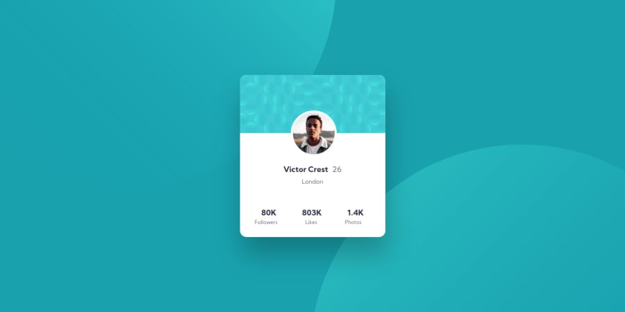
Design comparison
SolutionDesign
Solution retrospective
My first challenge solution. It is kind of hacky - especially the margin and padding of text elements in the card. I struggled to get things aligned correctly, but I think I know where I went wrong and will implement those changes in the next challenge.
Please give me any and all feedback. I could definitely use it...
Thank you for checking out my solution!
Community feedback
Please log in to post a comment
Log in with GitHubJoin our Discord community
Join thousands of Frontend Mentor community members taking the challenges, sharing resources, helping each other, and chatting about all things front-end!
Join our Discord
