Design comparison
Solution retrospective
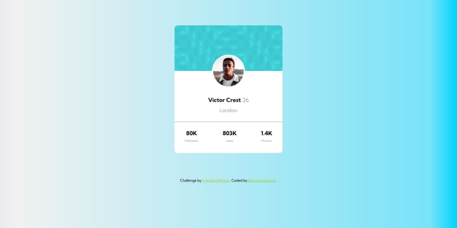
I found it quite challenging to position the profile picture in the middle, at the end I have decided to position it absolutely. I am very interested if there are any more dynamic ways to position it.
I could not figure out how to set the background of the body so I just used a gradient, although aI would really like to know the solution for that.
Community feedback
- @GregLyonsPosted over 2 years ago
Good work on using semantic HTML. Here's what I think you can do for the profile picture.
First, I'll point out then when I try to adjust the height on my computer, the alignment gets messed up, and the profile pic is no longer properly centered. I believe this is because of a height/margin mismatch between your
.card-top,height: 20vh;and your.profile_pic,top: 23%;properties. The issue is that the23%refers to23%of the.cardheight, whereas the20vhrefers to the screen itself. The former depends on the content of the card, whereas the latter depends solely on the viewport height. I'd recommend changing the.card-topheightto some sort of percentage instead, so that it depends on the height of your actual content itself. This'll prevent this weird behavior where things get out of alignment.As for positioning the profile pic, I'd still use absolute positioning, but in a different way:
1) Re-work HTML Put your
.profile-pic<img>inside your.card-top<div>, and putposition: relative;on.card-topinstead of on.card. This is so that you can position.profile-picrelative to the.card-topinstead of.card.2) Center horizontally Check out thgaskell's answer, as it has some good info on
left/rightvs.margin-left/margin-right. You may need to explicitly set the width of your element in this case. If you don't want to specify the width (it's not always desirable to do so), check out Adel's answer instead.3) Position vertically This is where setting
position: absolute;on.card-topinstead of.cardpays off. You want.profile-picto align with the bottom of.card-top, which you can easily do withbottom: 0;(on.profile-pic). Then you need to push.profile-picdown a bit more so that its centerline aligns with the bottom edge of.card-top. For that, you can addtransform: translateY(50%);to do the trick. Here, note that the "50%" in thetranslateYrefers to 50% the height of.profile-pic, NOT that of.card-top(this is different behavior than, e.g.height: 50%).This solves your responsivity issue (where the profile pic gets misaligned on different screen heights), because you're now binding the positioning of
.profile-picto the bottom edge of.card-top, instead of binding it to the top of.cardand then doing some percentage math to get the result on a particular screen size (a calculation which is very tricky and probably not stable across different screen sizes).Hope this helps, and best of luck in your future projects!
Marked as helpful0@zambobencePosted over 2 years agoDear @GregLyons, Thank you very much for taking the time and reviewing my code. I have moved the profile picture to the div you mentioned and used the transform attribute to align the picture vertically and the changing of the positioning of the card resolved also the margin problem in the card, now it seems to be correct.
I really appreciate your help, you gave me great insights and I have learned a lot from you, thank you.
Thank you very much.
1 - @PaliTriesToDesignPosted over 2 years ago
Hello!
I faced the same challenge with the background images. After researching a little bit in google I found out that you can use more than one image as a background image. Something like this:
background-image: url(/yourImage), url(/anotherImage);and then add properties to position correctly both images. I am not an expert but I hope it gives you just enough to find out the solution.Marked as helpful0@zambobencePosted over 2 years agoHello @PaliTriesToDesign, Muhcas gracias por tu apoyo y aporte creo que con tu ayuda al final si alcaraste mi duda con el fondo.
Saludos y mucho exito con tus siguientes proyectos.
0
Please log in to post a comment
Log in with GitHubJoin our Discord community
Join thousands of Frontend Mentor community members taking the challenges, sharing resources, helping each other, and chatting about all things front-end!
Join our Discord
