Submitted about 4 years ago
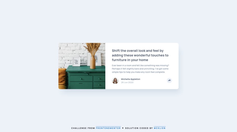
Card Component using ReactJS, HTML, TypeScript, SASS/SCSS
@mcktivity
Design comparison
SolutionDesign
Solution retrospective
which size unit(em, rem, px) you think would better fit in this challenge? and why? I tried to match the design as much as possible without the sketch design file.
Community feedback
- @ApplePieGiraffePosted about 4 years ago
Hey, Mcklien Ross!
This is a very small suggestion, but I think adding a hover state (such as a change of cursor or color) to the share button would be a nice touch. 😉
Otherwise, your solution looks good and responds well.
Happy coding! 😄
1@mcktivityPosted about 4 years ago@ApplePieGiraffe thank you for the feedback! I added hover effects and indeed it give a better feedback for the user.
0
Please log in to post a comment
Log in with GitHubJoin our Discord community
Join thousands of Frontend Mentor community members taking the challenges, sharing resources, helping each other, and chatting about all things front-end!
Join our Discord
