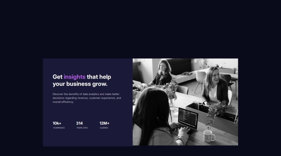


Design comparison
SolutionDesign

Solution retrospective
What are you most proud of, and what would you do differently next time?
I am glad I mastered several concepts like the box model, the grid system, sizing units. And ultimately the art of building responsive design.
What challenges did you encounter, and how did you overcome them?I had a setback while trying to ensure the project fits to all screen sizes. Thanks to wed.dev, I read through their documentations on responsive web design and I was able to overcome my challenge.
What specific areas of your project would you like help with?I would definitely love to explore several concepts involved in building responsive designs like media queries.
Community feedback
Please log in to post a comment
Log in with GitHub
Join our Discord community
Join thousands of Frontend Mentor community members taking the challenges, sharing resources, helping each other, and chatting about all things front-end!
Join our Discord