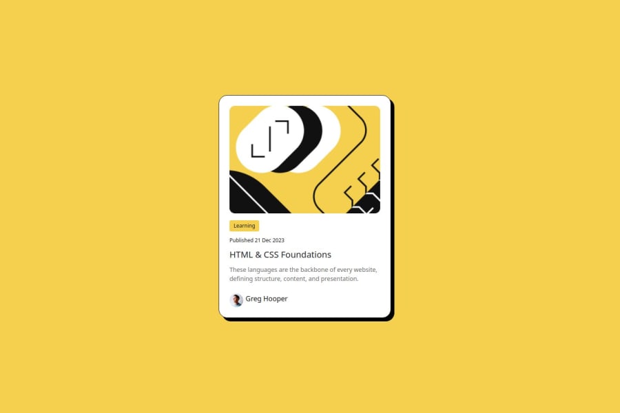
Card-Bootstrap-SCSS
Design comparison
Solution retrospective
I'm proud of mastering Bootstrap's responsiveness, which took some time but resulted in a clean, responsive design.
Next time, I'd focus on understanding Bootstrap's grid system earlier to speed up the process and explore more customization options.
What challenges did you encounter, and how did you overcome them?I encountered some clashing CSS rules while working on this project. I overcame them by refining my understanding of Bootstrap's classes and structure. Since this was a practice project, it was a great learning experience to deepen my knowledge of Bootstrap.
What specific areas of your project would you like help with?Feedback is welcome, especially on SCSS or Bootstrap.
Community feedback
- @coding-vasuPosted 7 months ago
Feedback
Looks Good!
Positive Points
- The screen is responsive.
- The code is simple & easy to understand.
- Overall, the solution seems pretty good.
Areas for Improvement
-
Semantic HTML: You need to work on using semantic HTML. For example, you could have used tags like
<time>,<figure>, etc. -
Design Details:
- You missed some font weights.
- Shadow on hover is missing (as shown in the Figma file).
- Tab index & focus states are missing.
Encouragement
If you practice your eye for detailing, you can do wonders.
Thank you for your effort!
Marked as helpful1@TedJenklerPosted 7 months ago@coding-vasu, thanks for your time. Looking back, I realize I missed a lot because I was too focused on Bootstrap.
0
Please log in to post a comment
Log in with GitHubJoin our Discord community
Join thousands of Frontend Mentor community members taking the challenges, sharing resources, helping each other, and chatting about all things front-end!
Join our Discord
