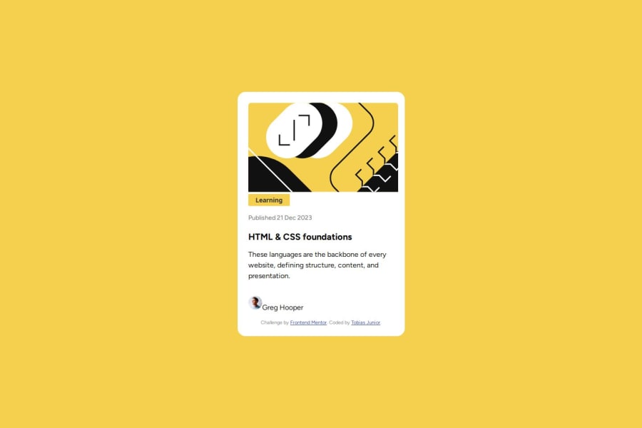
Design comparison
Solution retrospective
Proud of: Clean, responsive design and organized structure. Next time: Add interactivity, focus more on accessibility, and optimize performance.
What challenges did you encounter, and how did you overcome them?Challenges: Aligning elements consistently and ensuring responsiveness across devices.
Solutions: Used Flexbox for alignment and tested frequently on different screen sizes to adjust CSS as needed.
What specific areas of your project would you like help with?Help Needed: Enhancing accessibility features, optimizing performance e.g. image compression, and implementing animations or interactivity for better user engagement.
Please log in to post a comment
Log in with GitHubCommunity feedback
- @oddcc
Hi TobiasJunior,I found these issues
- the code link you provide is incorrect, the link is for the last practice
- the border line of the card and the shadow are missing in your solution. I use
border: 1px solid #111111;andfilter: drop-shadowto implement them
Join our Discord community
Join thousands of Frontend Mentor community members taking the challenges, sharing resources, helping each other, and chatting about all things front-end!
Join our Discord
