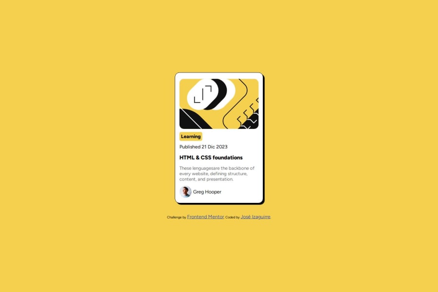
Design comparison
SolutionDesign
Community feedback
- @DavidJonahSivarubanPosted about 1 month ago
awesome dude! I just completed this one myself and had some issues with spacing/margin but you did a great job on that.
One thing i'd point is the hover effect on the "HTML & CSS foundation" header, which you could do by this:
.element:hover { color: rgb(244, 208, 78); {
Awesome job, otherwise!
Marked as helpful0@AVARUSJOSEPosted about 1 month agoThank you for your comments my friend and of course I will fix that, I had not thought of it, anyway thanks and blessings. @TheNewbie-Coder
0
Please log in to post a comment
Log in with GitHubJoin our Discord community
Join thousands of Frontend Mentor community members taking the challenges, sharing resources, helping each other, and chatting about all things front-end!
Join our Discord
