Design comparison
SolutionDesign
Community feedback
- @Abed001Posted 11 months ago
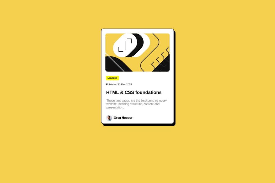
Nice work on this challenge! A suggestion I have is to use the yellow color that is found inside the style sheet that you have inside the style guide.it's better for the vision. also, you can add some margin on the bottom because, on the mobile screen, the card has a lower position and finally you have to add on the hover effect . just like this: .cardshadow{ box-shadow: 10px 10px rgba(0,0,0);
} .cardshadow:hover { box-shadow: 15px 15px rgba(0, 0, 0); /* Increase shadow size and opacity on hover */ } . keep going!!
1
Please log in to post a comment
Log in with GitHubJoin our Discord community
Join thousands of Frontend Mentor community members taking the challenges, sharing resources, helping each other, and chatting about all things front-end!
Join our Discord
