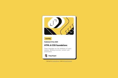
Submitted about 1 year agoA solution to the Blog preview card challenge
Card basico criado com CSS
@AlexxLuis

Solution retrospective
What are you most proud of, and what would you do differently next time?
Depois do primeiro desafio estudei mais os fundamentos de CSS e aprendi a lidar melhor com a criação de estilos então não tive dificuldade, porem aceito dicas para melhorar cada vez mais na estilização.
What challenges did you encounter, and how did you overcome them?Não encontrei desafios
What specific areas of your project would you like help with?Nada a declarar, consegui desenvolver o projeto com facilidade
Code
Loading...
Please log in to post a comment
Log in with GitHubCommunity feedback
No feedback yet. Be the first to give feedback on Alexandre Escobar's solution.
Join our Discord community
Join thousands of Frontend Mentor community members taking the challenges, sharing resources, helping each other, and chatting about all things front-end!
Join our Discord