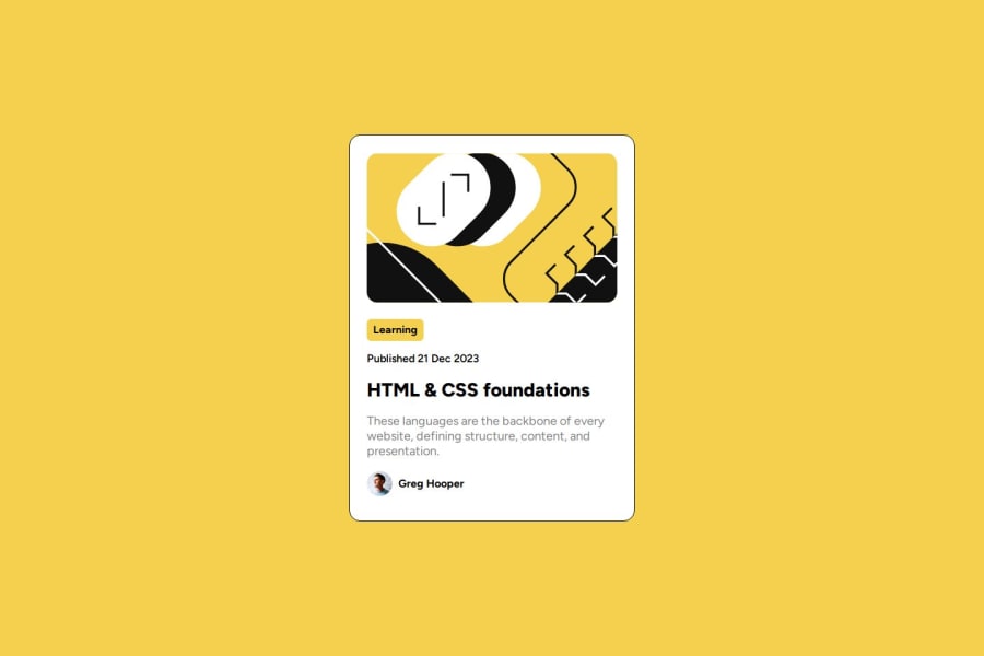
Design comparison
Solution retrospective
I am proud that I did it. My code, however is clustered and this took me alot longer than expected. I wish I just refactored and redid some stuff instead of just fixing mistakes with more code.
What challenges did you encounter, and how did you overcome them?I got lost in that I created a flexbox inside of the flexbox that contains the white part, to store my content. Flexbox was difficult to navigate as everytime I added margin or padding, something went off the container. I dont remember how I fixed it. I wish I just created one flexbox div for the big picture, and another for the text and stuff so that I dont run into the same issues.
What specific areas of your project would you like help with?I would like to know if its possible to move flexbox divs and never go over the container width.
Community feedback
- @vakho-363Posted 9 months ago
It would be nice if you could add it -- box-shadow.
responsive-nice! padding-nice! fonts, font-sizes, font-weights-nice!!! img-styles-wery nice!
You are very cool my friend!!!
0
Please log in to post a comment
Log in with GitHubJoin our Discord community
Join thousands of Frontend Mentor community members taking the challenges, sharing resources, helping each other, and chatting about all things front-end!
Join our Discord
