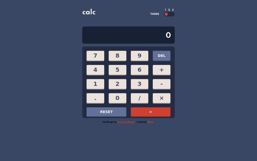
Design comparison
Solution retrospective
I'm so happy I was able to complete this challenge, it took me over a week and every ounce of resilience I have in me to see it through.
Please I would love your feedback :)
Community feedback
- @AlexKMarshallPosted about 3 years ago
Hey there, this looks very good, and there are some very nice touches.
I like that you've used a radio button for the theme switcher, that ought to make it accessible, but it needs to have some focus styling so it can be used with the keyboard. Also, the 1, 2, and 3 really ought to be part of the input label, so they become clickable.
I love the fact that you're keeping the operator button highlighted after it's pressed, that's great to remind you which operation you're doing.
It shrinks well, down to a pretty small screen. But the font-sizes should be based in
remsnot pixels, so that it works for users that customize their base font size.There's a bug in the calculation. It doesn't remember a series of operations properly. So if I do 1000 + 4 - 2, it says the answer is 2, when it should be 1002.
Are you able to format the output display so that it includes the thousand separators? At the moment a very big number is just a series of digits, so can be a bit difficult to read.
Intl.NumberFormatshould help with that.In general though, this is very well done.
Marked as helpful1@mikeyxxPosted about 3 years ago@AlexKMarshall Thank you for the feedback Alex, I will get on them now
0
Please log in to post a comment
Log in with GitHubJoin our Discord community
Join thousands of Frontend Mentor community members taking the challenges, sharing resources, helping each other, and chatting about all things front-end!
Join our Discord
