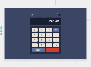
Design comparison
SolutionDesign
Solution retrospective
First intermediate project submission on Frontend Mentor. Any and all suggestions are greatly appreciated.
Community feedback
- @elroytoscanoPosted almost 3 years ago
The design is pixel perfect and the functionality is on point. Great job.
You could improve the visual feedback by having
cursor:pointeron interactive elements like buttons and the theme switcher.Your accessibility warning can be taken care of by wrapping the "calc" text in a
h1instead of adiv.Download AXE dev tools so that you can clear any accessibility issues while coding : https://www.deque.com/axe/devtools/
Hope this helps.
1
Please log in to post a comment
Log in with GitHubJoin our Discord community
Join thousands of Frontend Mentor community members taking the challenges, sharing resources, helping each other, and chatting about all things front-end!
Join our Discord
