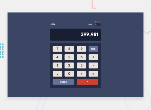
Design comparison
SolutionDesign
Solution retrospective
Hi there 👋, I’m Kamil and this is my solution for this challenge. 🙂
🛠️ Built With:
- Vite
- vanilla HTML/CSS/JS
- npm - prettier
Any suggestions on how I can improve and reduce unnecessary code are welcome!
Thank you. 😊✌️
Community feedback
- @deep0133Posted over 1 year ago
Hey there, I noticed that the project's appearance could be improved on smaller screens, particularly those below 360px. To optimize the user experience on such screens, consider adding the following styles to the body: body { /* ... previous styles */ min-width: 360px; overflow: auto; }
1
Please log in to post a comment
Log in with GitHubJoin our Discord community
Join thousands of Frontend Mentor community members taking the challenges, sharing resources, helping each other, and chatting about all things front-end!
Join our Discord
