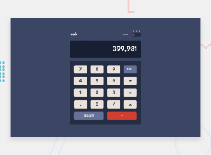
Design comparison
Solution retrospective
I finished the calculator, trying to stay as faithful to the design as possible.
I'm always looking for tips for code, readability, and optimization. A look at the code is very welcome.
Community feedback
- @ayminahmedpkPosted almost 3 years ago
100% pixel perfect on the desktop and nice working calculator. Nice ux detail with the default text being darker as well. Having said that, it's not perfect for mobile. It's obvious looking at the desktop that you could do it for mobile too, but since it's for practice, might as well implement it.
You asked about code readability and optimization. Well, I looked at your sass and there's a couple of things you can do to simplify it. Firstly, even though it is clearly commented so I know what section is responsible for what, it is still kinda long and scary. If you split it into smaller partials and imported them into one main file, that would we much cleaner. Also, try SASS lists. With lists you can define all the color variables in one place, and then write color styles only once, and use @for to generate 3 different styles for 3 different themes. Makes the SASS much shorter.
Your calculator code is very short (at least compared to mine) and works well. One thing you could do is, instead of sending out the normal output, you can have the output go through .toFixed(3) if it is a fraction, so if someone calculates 1/3 it won't be 0.333333... outside the calculator display.
You are using 'eval' in your JS. I've been told by the internet to simply avoid it since it is too dangerous, so you might want to avoid it in real life. I made a calculator once using eval too, so I made it again, this time without eval just to compare my new code style.
Also, just like with SASS, your JS has the theme switching code and also the calculator code in the same place. I would suggest you try to separate these files since they relate to different areas of your app. Smaller files will allow you to reuse your code easily, such as the theme switching mechanism for another site, etc.
Oh yeah, one more thing. You could try using cookies or local storage to save the current theme in browser storage to persist between page refresh. It is just an optional objective for this challenge, but it's kinda fun if you try it.
Finally, if you want to see an example of all of the above, check out the repository of my solution. I have continued to work on it even after I submitted it (cleaned my SASS with lists just now), and may resubmit it too. It's not as pixel-perfect as yours, but you can see the things I was talking about regarding code.
All the best.
Marked as helpful1@K0smicPosted almost 3 years ago@ayminahmedpk thanks so much for the tips, they are always appreciated!
I've opened “Issues” on GitHub with your recommended improvements, plus I've added your name in the “Acknowledgments” section in README.md!
Greetings!
1
Please log in to post a comment
Log in with GitHubJoin our Discord community
Join thousands of Frontend Mentor community members taking the challenges, sharing resources, helping each other, and chatting about all things front-end!
Join our Discord
