Design comparison
Solution retrospective
I recently completed a calculator project using Svelte and I'm extremely proud of the final result. Although this was my first Svelte project, I found the experience to be amazing. While this project did test my skills, it was relatively straightforward and didn't involve endless hours of troubleshooting and problem-solving. Most issues that arose were solved quite quickly.
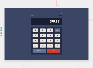
One of the design elements that I'm particularly proud of is the theme switcher button. It not only has a smooth transition but also looks almost identical to the original design. While I didn't spend time making the sizes pixel-perfect, I prioritized the calculator's functionality and overall design.
Overall, I think I did a great job on this project, despite the tedious task of copying and pasting the 30+ color variables from the style guide. It would have been helpful if they had included a pre-made list of SCSS variables.
I'd love to hear any feedback on the design! :3
Community feedback
- @EmilBacklundPosted over 1 year ago
Design looks nice! I like the switch button that you made and the background transition while switching from one theme to another. I have never used Svelte myself, so good job with that ^^
One thing that I noticed with the calculator is that it seems that you have forgotten to remove a console.log from when pressing the period ( . ) button. My teacher always nags me to remove my console.logs before deploying a project hehe.
0
Please log in to post a comment
Log in with GitHubJoin our Discord community
Join thousands of Frontend Mentor community members taking the challenges, sharing resources, helping each other, and chatting about all things front-end!
Join our Discord
