Submitted 7 months ago
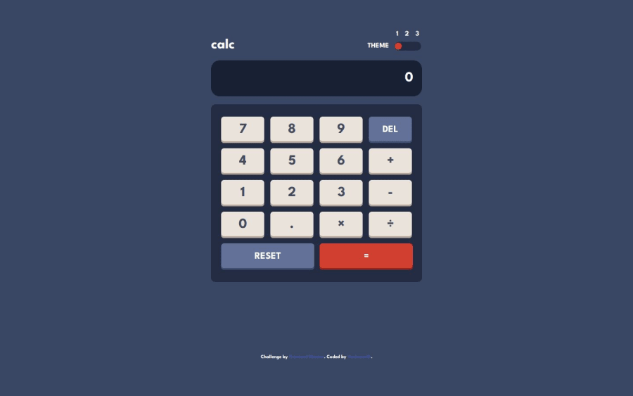
Calculator with Theme Switcher
#bem#sass/scss
@yashwanth-srinivasa
Design comparison
SolutionDesign
Solution retrospective
What are you most proud of, and what would you do differently next time?
I was able to SASS and a few of its additional functionalities like mixins and functions. Using the BEM model to name my elements and use nesting to make my life easier.
What challenges did you encounter, and how did you overcome them?I particularly felt a little lost dealing with CSS Grid and Flexbox, but after a few trial and errors, I was able to take control of the layout.
What specific areas of your project would you like help with?I did not use prefers-color-scheme or localStorage because I do not know how to use them. Yet. Future projects will certainly have them to improve UX.
Community feedback
Please log in to post a comment
Log in with GitHubJoin our Discord community
Join thousands of Frontend Mentor community members taking the challenges, sharing resources, helping each other, and chatting about all things front-end!
Join our Discord
