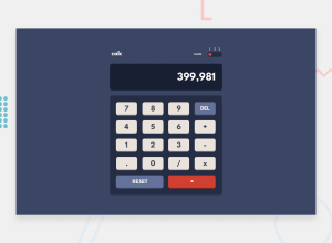
Design comparison
Solution retrospective
Just completed this challenge, maybe I could refactor source or improve styles.
How good do you think my implementation is?
Community feedback
- @alsirPosted almost 3 years ago
solid work .but if you make it to fit the screen without needing to scroll it will much better. I realize that the delete button is set as the same as the reset button. hey the code I used to make the delete button work : function del(){ var value=document.getElementById('screen').value; document.getElementById('screen').value=value.substr(0,value.length-1); }
Marked as helpful0@xs30snwPosted almost 3 years ago@alsir Thanks a lot for your reply, I definitely should adjust the size and proportions of my app.
I see what you mean: by pressing 'Del' you delete only the last digit in the current number, just like 'Backspace' key on keyboard. For some reason I thought that's a different key, that exist on some calculators and looks like a horizontal arrow. My idea is that 'Del' should purge the current number, but keep the previous number and the pending operation (if there are any). And 'Reset' purges all the variables and resets calculator to the default state.
Del is like CE; Reset is like C.
But maybe I'm wrong.
1 - @renrasPosted almost 3 years ago
Hi, great work! I like how your theme switcher works.
Few things I think it can improve on:
- When I press the decimal, it gives me a comma instead.
- The evaluated value just gives me a whole number and removes the decimal
- I think it's better if you show the history on the screen instead of showing zero when I press an operator (e.g 8 + 8)
0
Please log in to post a comment
Log in with GitHubJoin our Discord community
Join thousands of Frontend Mentor community members taking the challenges, sharing resources, helping each other, and chatting about all things front-end!
Join our Discord
