Design comparison
Solution retrospective
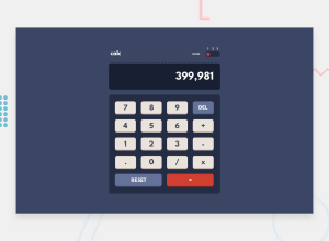
My second project! learnt about grid and theming in this project. Feel free to resize however you want and it still looks good.
I chose to write the input in such a way that it doesn't calculate until user presses "equal" button. The input gets very long but i used element.scroll to keep input in the right place. i wrote the calculator with an array of operands and operators strings in order with a parse function to calculate it. Any advice on how to do this better? Also, any advice on my coding style would be greatly appreciated!
Disabled decimal "dot" button coz realized there are a lot of edge cases that I need to write the logic for and I got lazy. Also got lazy for the commas too. Another bad thing is Negative numbers are kind of awkward with the -ve sign stuck closely at the front. But generally am satisfied with what i made.
Community feedback
Please log in to post a comment
Log in with GitHubJoin our Discord community
Join thousands of Frontend Mentor community members taking the challenges, sharing resources, helping each other, and chatting about all things front-end!
Join our Discord
