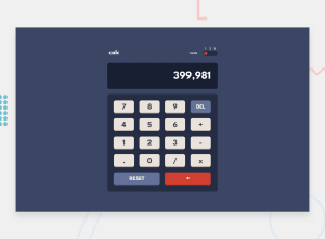
Design comparison
Solution retrospective
Any feedback would be gratefull!
Community feedback
- Account deleted
I also noticed some things.
It does not let you do two signs at once, like you can't add and multiply at once, so that takes out the functionality of dealing with two negative numbers, and I think the dot should be restricted to only one entry if one were to attempt to click a bunch of them one after the other.
btw, looks and works good nonetheless.
2@Lusk1nhaPosted over 3 years agoThanks for the suggestion, with it I was able to rework my code for something better. I think he is now much better, thanks again.
0 - @palgrammingPosted over 3 years ago
Looks good
I did see 2 things:
One on desktop size the button did not become as wide as the design but without the design sketch file that would be hard to know
second the logic has problem with non whole numbers example 0.5 + 0.5 = 5.5
1@Lusk1nhaPosted over 3 years agoThanks for the suggestion, with it I was able to rework my code for something better. I think he is now much better, thanks again.
0
Please log in to post a comment
Log in with GitHubJoin our Discord community
Join thousands of Frontend Mentor community members taking the challenges, sharing resources, helping each other, and chatting about all things front-end!
Join our Discord
