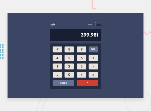
Design comparison
Solution retrospective
Hi guys !
It would be very nice if you guys could give me some feedback on this challenge :) There are many possibilities of problems on this one lol I did it using Vue 3 and making a localStorage on the user-preference-Theme
Thanks , have fun ! :D
Community feedback
- @SkidragonPosted over 2 years ago
Hi Allan, nice job completing the challenge and it being useable! For the small buttons, grid-template-columns: repeat(4, 1fr) and grid-template-rows: repeat(4, 1fr) would have made a 4 by 4 grid then the big buttons at the bottom could have been grid-template-columns: repeat: (2, 1fr). Also the buttons should be button elements rather than div elements, I can't use the accessibility capabilities that buttons have like keyboard accessibility. Anyway three components could be made here to organize it: Button, Display, and RangeInput. Putting the CSS with those components into seperate files would be easier to read through the code and to create better names for the CSS rather than for1, for2, for3 or div1, div2, div3. Material UI has a variant property prop to change the buttons styles like 'primary' or 'secondary'.
Marked as helpful0@AllanguiPosted over 2 years ago@Skidragon Thanks a lot for your returns Simon ! I updated some things :)
0
Please log in to post a comment
Log in with GitHubJoin our Discord community
Join thousands of Frontend Mentor community members taking the challenges, sharing resources, helping each other, and chatting about all things front-end!
Join our Discord
