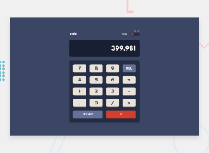
Design comparison
Solution retrospective
i make this calculator for 4 weeks , I think this challenge is very difficult, because here I have never implemented a class in Javascript directly. I get a lot of help from google and youtube, maybe after this challenge I want to make my own version of the calculator without the help of others.
Please give me advice, to be better in the future. thank you :)
Community feedback
- @Ramz001Posted over 2 years ago
Hello Afif, Good job completing this challenge !
Your solution is pretty good but I have a few suggestions mostly in terms of design.
Firstly, you should make your calculator wider and try to make it as close to the provided design as you can.
Secondly, for theme switching you can use input type range so that the switching is more smooth and with a couple of properties it would work in all major browsers.
Also, you have some issues with your semantic html markup so it's better that you fix and I do not think it's gonna take a long, especially at this moment when you spend a month completing this challenge.
Overall, NICE JOB I think you should really feel proud at this moment and keep on overcoming challenges!
Marked as helpful2@mafif21Posted over 2 years agoHi @Ramz001 wherever you are, I am very grateful for the advice you give
0
Please log in to post a comment
Log in with GitHubJoin our Discord community
Join thousands of Frontend Mentor community members taking the challenges, sharing resources, helping each other, and chatting about all things front-end!
Join our Discord
