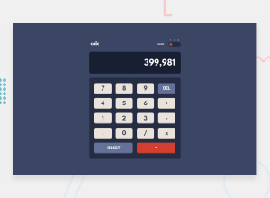
Design comparison
Solution retrospective
The theming was difficult to do using tailwind, luckily we found a video on youtube.
Community feedback
- @elaineleungPosted about 2 years ago
Hi George, great work in building this calculator! I just got some quick comments for you after playing around a bit with it:
-
I'm viewing this on my laptop and the bottom is cut off a bit; this is because you used
height: 100vhinstead ofmin-height. You can check this by resizing the browser window to be a bit shorter than the content. Try changing it tomin-heightand see if that works, and try to add a bit of top and bottom margin to help add some spacing. -
I think I see that you're using
eval()in your code; I also did that first but eventually I changed it to a switch statement. I'd caution against usingeval(), which is something you can read about on MDN: https://developer.mozilla.org/en-US/docs/Web/JavaScript/Reference/Global_Objects/eval
Hope some of this can help you!
1@tenderkingPosted about 2 years ago@elaineleung hi thanks for the comment, I fixed the styling issues, hopefully ythey shoud be good on your laptop. the eval() i didn't knoww about that, I'll have to think about it and how to implement it.
0 -
- @ChamuMutezvaPosted about 2 years ago
Hi George. Nice work on your calculator . Here are some improvements you can make:
- Press any digits continually and watch the whole layout break, at the same time a calculator should have a maximum number that it can take, we can not have a calculator that can accept digits as long as one can press a key.
- prevent this
0.11.32.39with some conditions that allows not accepting more that one decimal point. - try the following calculation
0.1 + 0.2
Happy Coding
0
Please log in to post a comment
Log in with GitHubJoin our Discord community
Join thousands of Frontend Mentor community members taking the challenges, sharing resources, helping each other, and chatting about all things front-end!
Join our Discord
