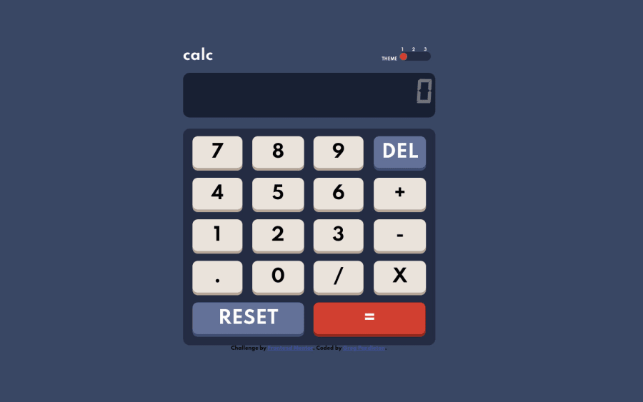
Design comparison
Solution retrospective
I did this with a table for the keypad, would a grid be better?
Community feedback
- @A-amonPosted over 3 years ago
Hello! Great work, the responsiveness looks good too~
I have a few suggestions:
-
Using table for keypad is certainly unique! 😲 But I think (So don't take my words for this) grid would definitely be better.
-
Instead of creating empty spans e.g. .shadow, .edge, you can try using pseudo-elements for the styles. 😀
-
Using all divs for the toggle button won't let screen reader users to know whether they should do something to it or not. You can try using radio-buttons or any suitable alternatives~ 🤔
Marked as helpful0 -
Please log in to post a comment
Log in with GitHubJoin our Discord community
Join thousands of Frontend Mentor community members taking the challenges, sharing resources, helping each other, and chatting about all things front-end!
Join our Discord
