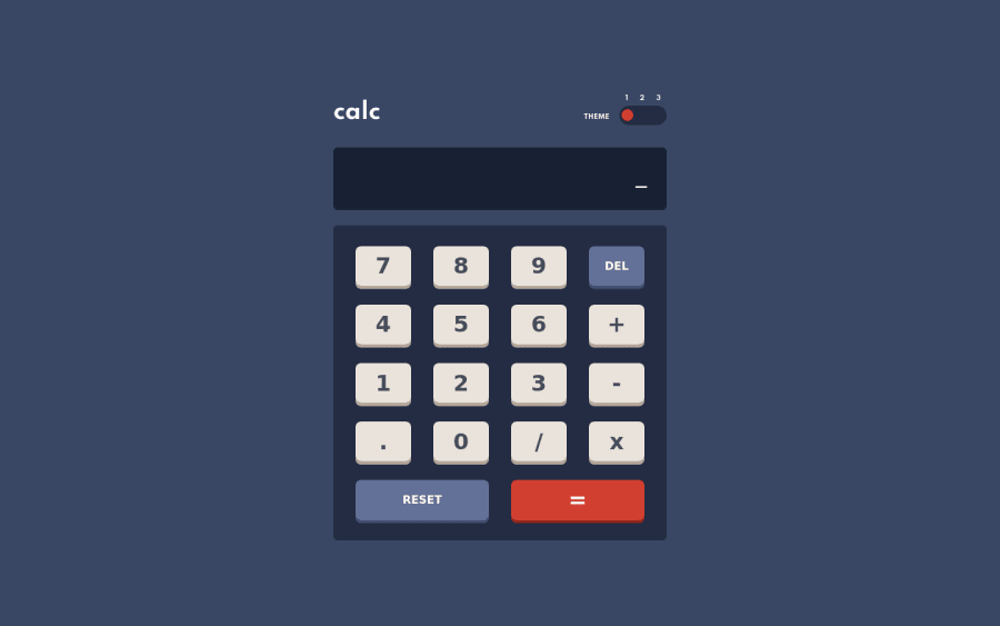
Not Found
Not Found
Not Found
Not Found
Not Found
Not Found
Not Found
Not Found
Not Found
Not Found
Not Found
Not Found
Not Found
Not Found
Not Found
Not Found
Not Found
Not Found
Not Found
Not Found

Submitted

Calculator using HTML, CSS and vanilla JavaScript

Simeonβ€’ 30

@simeonbain

Desktop design screenshot for the Calculator app coding challenge

This is a solution for...

  • HTML
  • CSS
  • JS
3intermediate
View challenge

Design comparison


SolutionDesign

Solution retrospective


Any feedback would be appreciated. In particular:

  • if my use of flexbox and grid can be improved/align better with best practice?
  • if my JavaScript is readable and understandable?

Community feedback

P
Alexβ€’ 2,010

@AlexKMarshall

Posted

There's a bug in the calculation. If you do 1 + 6 + 3 it's giving 11.

Other than that, it looks great, the responsiveness works well down to very small screens.

Well done on the theme toggle, it works great with a keyboard, focus stylings are all there too.

It might be nice to have some :hover / :active states on the buttons for a bit more visual feedback when you click them.

You could get rid of your .keypad-main and .keypad-bottom wrappers by just using grid-column: span 2 on the last 2 buttons.

The only thing I can find to pick up on is the <p>THEME</p>. Some screen readers will read that as individual letters T H E M E. So instead, use lowercase in the html and text-transform: uppercase in the CSS.

I've only had a quick scan through the javascript file, but it looks well laid out and very readable to me.

Marked as helpful

1

Simeonβ€’ 30

@simeonbain

Posted

@AlexKMarshall thanks for the detailed feedback and suggestions!

I couldn't replicate the bug you mentioned. 1 + 6 + 3 is consistently resulting in 10 for me. But if you are able to work out how to replicate it, then let me know!

I've now added :active states on the buttons as you suggested.

I have also implemented your suggestion of writhing 'THEME' in lowercase in the HTML and instead styling it as uppercase in the CSS for accessibility.

Thanks again.

0
David Dyerβ€’ 185

@davidbdyer

Posted

@simeonbain I was thinking people using a screen reader wouldn't need to interact with the themes. You could hide them from a screen reader with an aria-label.

0
P
Alexβ€’ 2,010

@AlexKMarshall

Posted

@davidbdeath I disagree here. While the main users of screen readers are blind or have low vision, not all are.

From https://webaim.org/techniques/screenreader/ " Screen readers are also used by people with certain cognitive or learning disabilities, or users who simply prefer audio content over text. "

So someone using a screen reader may well want to control the theme, and as it is fairly straightforward to make that accessible, it should be done.

0
David Dyerβ€’ 185

@davidbdyer

Posted

@AlexKMarshall The use case of the person who simply prefers audio content over text isn't relevant. They can see well enough to interact with the theme controls; it's not an accessibility issue. People with certain cognitive or learning disabilities is a nebulous descriptor and could mean anything. Having the screen reader read the theme controls could just as likely be confusing and more a hindrance than a benefit. It seems like a benefit for the visually impaired for the website to quickly direct the screen reader to the relevant section.

0
David Dyerβ€’ 185

@davidbdyer

Posted

It doesn't take keyboard inputs.

0

Simeonβ€’ 30

@simeonbain

Posted

@davidbdeath Thanks! I've added keyboard input now

0

Please log in to post a comment

Log in with GitHub
Discord logo

Join our Discord community

Join thousands of Frontend Mentor community members taking the challenges, sharing resources, helping each other, and chatting about all things front-end!

Join our Discord