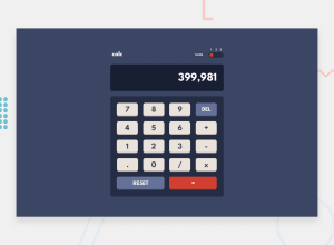
Design comparison
Solution retrospective
So guys this challenge really got to me, fell sick in the process. I couldn't make anymore improvement on the code so I don't get demotivated.
I was having an issue setting a limited number for the display. I had already built the calculator after figuring out that, I could use input as the display which allows me use the "max-length", so when i try to change my HTML code, it breaks the whole thing.
For the display, i used <div id="display"><div>, then manipulated the whole thing from javascript.
Does anybody have an idea on how one can have a limited number of text when using javascript DOM manipulation? Or using input "max-length" is the only way?
Community feedback
- @ChamuMutezvaPosted about 2 years ago
Hi Tomisin Awoniyi. So far so good, here is my observation:
HTML
- as mentioned by @AdrianoEscarabote, some elements are more important than others as they give meaning to your project, elements such as the
mainare considered important as that is where the the central functionality of an application is contained. The divs and related elements should be elements of last resort - a div has no semantic meaning. - Generally a site should have an
h1heading element as the first heading element with the rest following a sequential order without skipping headings. - since the theme switcher has 3 options, the best elements to use , in my opinion, will be a set of radio buttons - a checkbox is not suited in this instance.
JS
- try the following calculation
0.1 + 0.2 - yes the calculator should have a maximum number that it should take , you can set a condition using
display.textContent.lengthsuch that it should not be greater than a certain length. - make sure to have the condition that allows not more than one decimal point as in the following
6123.......and the same as the order of operators , eg6123.......++++++***0
Happy coding
Marked as helpful1 - as mentioned by @AdrianoEscarabote, some elements are more important than others as they give meaning to your project, elements such as the
- @AdrianoEscarabotePosted about 2 years ago
Hi Tomisin Awoniyi, how are you?
I really liked the result of your project, but I have some tips that I think you will like:
1- All page content should be contained by landmarks, you can understand better by clicking here: click here
2- Document should have one main landmark, you could have put all the content inside the
maintag click hereI noticed that the content is not centered to fix this we can do the following:
I added:
body {
    display: flex;
    justify-content: center;
    min height: 100vh;
    align-items: center;
}
The rest is great!!
Hope it helps...👍
Marked as helpful0@tomisin2kPosted about 2 years ago@AdrianoEscarabote Thank you Adriano!!! I appreciate and thank you for sharing your light brother, one love man!
1
Please log in to post a comment
Log in with GitHubJoin our Discord community
Join thousands of Frontend Mentor community members taking the challenges, sharing resources, helping each other, and chatting about all things front-end!
Join our Discord
