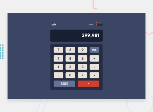
Design comparison
Solution retrospective
Wow, this one was quite the challenge. I enjoyed writing the CSS for this one, but the JavaScript to make the calculator function was not easy. I got it working as I wanted, but it's definitely not perfect. I'm looking forward to viewing everyone else's solutions.
One of my focuses has been writing semantic HTML, and also accessibility, so if there's anything I could improve in those areas, I'd love to hear it! Any feedback would be much appreciated. 🙂
Community feedback
- @FluffyKasPosted over 2 years ago
Hey,
It looks really great! I haven't done this challenge yet but I can see it has a bunch of complicated elements but you seem to have nailed it.
The only thing I'd look into is to make that theme switch accessible. At the moment it isn't, even though it looks great >.< This is honestly pretty tricky to do but I'll leave an article and a codepen example here that may help to give you an idea. To sum it up, radio inputs would be the best here and <legend> element for the "theme" text perhaps.
As an extra feature, you could add the selected theme to local storage so whatever the user chose last time would stay for the next time they open up your app. This is just a small convenience though, not super essential but it might be a nice opportunity to look into how local storage works! ^^
Marked as helpful1@crsimpson5Posted over 2 years ago@FluffyKas Thanks for the feedback! That was a great article on creating accessible switches.
I'll work on redoing my switch, and may try the local storage feature as well.
Thanks 😀
0
Please log in to post a comment
Log in with GitHubJoin our Discord community
Join thousands of Frontend Mentor community members taking the challenges, sharing resources, helping each other, and chatting about all things front-end!
Join our Discord
