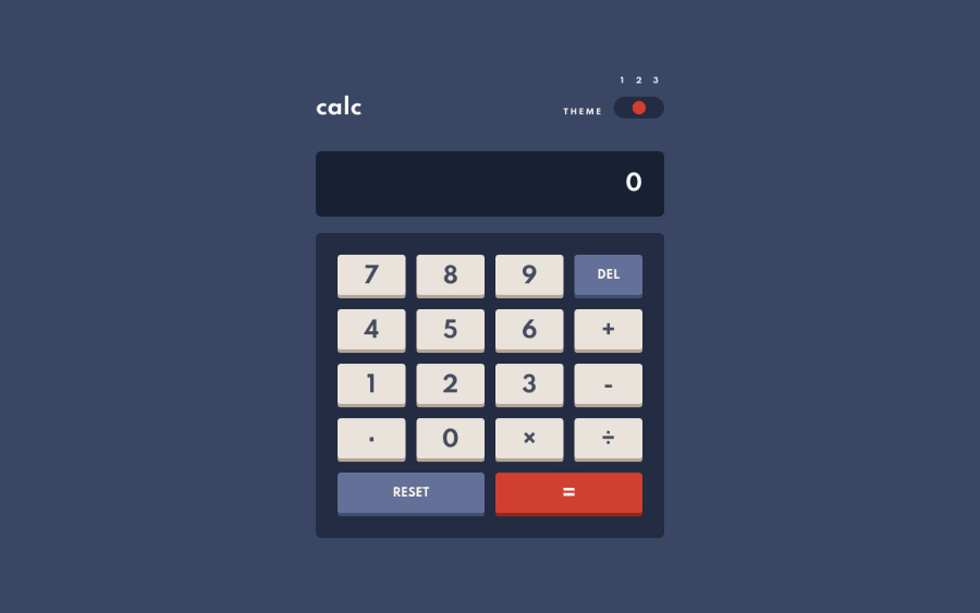
Calculator built with XState and React
Design comparison
Solution retrospective
This was my first time using XState for a full project, and I found it very useful for setting up the logic of this app.
I loved the theming of this. It was the first time I didn't have to tweak the contrast for accessibility either. CSS Custom Properties made this very straightforward.
Any feedback welcome
Community feedback
- @pikapikamartPosted about 3 years ago
Hey, really nice work on this one. Layout in general looks really great.
This challenge makes it hard for me suggest some things out but for just little ones, here are some:
- Theme toggles should be wrapped inside a
fieldsetalong with alegendtag. Thelegendtag text-content should be thethemeword, this way users will know what are the purpose of the set of radio-buttons. - Adding a visual-indicator on those toggles. You could use
focus-withinand target the small-circle to have anoutline. That way, when the focus is on the radio-buttons, the selector will put an outline on the circle. - Adding
cursor: pointerfor those interactive elements on desktop layout so that they appear more natural since they are interactive. - You could have added a screen-reader only
h2inside themainthat describes what is the main content is all about. buttondoes not needtype="button"since they are not inside aformthat turns them totype="submit".- Also, you could achieve those shadow at each button's bottom by using a
box-shadowwithinsetlike:
box-shadow: inset 100px 1px 1px 1px red;on the
button.Aside from those, really great job on this one.
Marked as helpful0@AlexKMarshallPosted about 3 years ago@pikamart Thanks very much for your very detailed review
- For the
fieldset. That definitely would be the most semantic way for the html to be structured, but I have been completely unable to find a way of flexibly positioning thelegend. It doesn't respect the usual positioning algorithms. If there's a way to make it behave in a flex-container I'd love to use it instead. - You're absolutely right, I completely missed the focus indicator on the switch, I'll get that fixed
- For the cursor pointer, research seems to indicate that it should not be used for buttons that are obviously buttons. And that on the web it should only be reserved for links https://medium.com/simple-human/buttons-shouldnt-have-a-hand-cursor-b11e99ca374b that said, many apps do make everything clickable have a pointer cursor, and that article is 5 years old. I couldn't find newer accessibility research on it. But I tend to lean on the fact that if buttons should have a pointer, the browser would implement that.
- For the hidden header, I'm not sure I agree here. The title of the app is "calculator", as the main section is implementing that, I think that would be adding unnecessary noise to the screen-readout. If the main contained anything other than the calculator functionality, then it would indeed need an additional heading.
- For type="button". Yes, this is technically unnecessary when not inside a form. However, when building potentially re-usable components, it's always helpful to provide a default value for it. In a project many other developers may end up using the component, and may use it inside a form. It's safest to supply the button default type, and users can then explicitly specify type submit for a form submission button, preventing unintended submission when you have multiple buttons.
- For the box shadow, this is a great way to achieve the shadow, and I did initially have it generated that way. However, I wanted to a have a key-press animation that involved shifting the button downwards slightly and shrinking the shadow. Animating box-shadow is comparatively expensive on performance and can result in janky animations. By separating it out into a pseudo-element, the animation can just be on transform, which will run smoothly. The other benefit of having the inner pseudo-element is you won't get a flickering animation if the user presses near the edge of the button as described in Josh Comeau's article https://www.joshwcomeau.com/animation/css-transitions/#doom-flicker
I really appreciate all of the points though, these are all things that we need to think about and decide solutions for.
1@pikapikamartPosted about 3 years ago@AlexKMarshall Hey, glad to be back in here.
I rarely get to receive a detailed reply whenever doing reviews so this is really great to received one^^
- For the
fieldsetyou can just useposition: absoluteon thelegendwhile removing theborderin thefieldsetsince by default it places right the legend on the top-left of thefieldset. This way, even if thefieldsetis using flexbox, it won't affect the placement of thelegend. - I haven't thought about that idea of browser implementing cursor if actually needed for interactive elements like
button. Thank you for this one^ - I suggested adding once since navigating by landmark on the layout inside the
mainwill just state "zero" since it is the first-text content inside it compared to when having another heading on it. - That actually makes sense about the
typeincluding when reusing as components. Another takeaway on this reply^^ - Ooh, I actually didn't noticed that one, about the
buttonbeing translated downwards a bit and changing the bottom part's color and sincebox-shadowcan just hurt performance and using just the pseudo is more suitable.
Again, thanks for this one and really appreciate receiving this kind of replies^^
Marked as helpful0 - Theme toggles should be wrapped inside a
Please log in to post a comment
Log in with GitHubJoin our Discord community
Join thousands of Frontend Mentor community members taking the challenges, sharing resources, helping each other, and chatting about all things front-end!
Join our Discord
