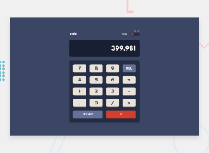
Design comparison
Solution retrospective
Credits: Web Dev Simplified's
Community feedback
- @elaineleungPosted about 2 years ago
Hey Eddie, this looks great on the whole 😊
I also just completed this challenge and got some quick feedback here:
-
The buttons animation is something I actually wanted to do and I haven't seen anyone do it, so good job! One suggestion to give here is, you can try adding a
transform: translateY(0.4rem)in the hover state to make the button look "pressed" in addition to the box-shadow and filter, and I might give it a 0.2s duration instead of 0.3s. -
I recognize the code you used because I also looked at Web Dev Simplified's calculator as a reference, and I built it after following his tutorial. It would be nice to give him credit (which I've done in my solution), as this is part of the community guidelines. I don't seem to see his name mentioned anywhere, but in case you did give him credit or mentioned him, then that's great.
Other than that, it's good work 🙂
Marked as helpful1@eddieelorzaPosted about 2 years ago@elaineleung Hi! Thanks for your contribution!! and of course I will give the credits!!
1 -
Please log in to post a comment
Log in with GitHubJoin our Discord community
Join thousands of Frontend Mentor community members taking the challenges, sharing resources, helping each other, and chatting about all things front-end!
Join our Discord
