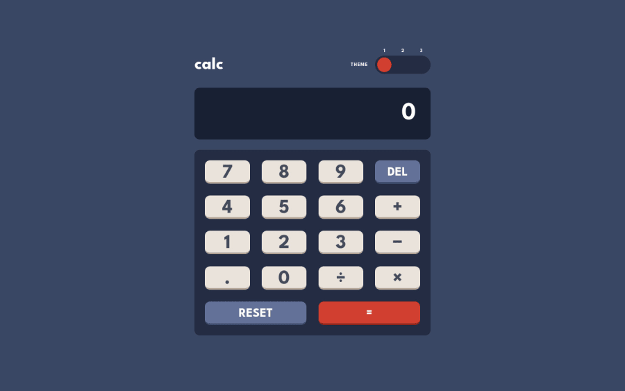
Design comparison
SolutionDesign
Solution retrospective
Layout was fairly straightforward. My initial approach to the toggle switch was to try a tri-radio button design and it seemed to work out. Then, came the calculator implementation and that took a bit more effort compared to the earlier stages. As an extra bonus, I added a crude automatic font scale based on number of digits entered and also checks window resize.
Community feedback
Please log in to post a comment
Log in with GitHubJoin our Discord community
Join thousands of Frontend Mentor community members taking the challenges, sharing resources, helping each other, and chatting about all things front-end!
Join our Discord
