Design comparison
SolutionDesign
Solution retrospective
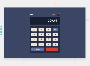
This is my solution for this challenge
Community feedback
- @wanlucasPosted over 2 years ago
hello, Mohamad Krayem!
It's pretty cool, I like the theme change animation. but there are a few things to fix:
The selector is not well centered when theme 2 is active.
It would also be important for the expression to appear on the screen in real time, but the number disappears when the expression is typed.
Marked as helpful0
Please log in to post a comment
Log in with GitHubJoin our Discord community
Join thousands of Frontend Mentor community members taking the challenges, sharing resources, helping each other, and chatting about all things front-end!
Join our Discord
