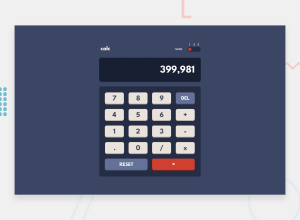
Design comparison
Solution retrospective
Recreated the calculator and tried to better than last time. I would love some input on this to get better at this.
Community feedback
- @mukwende2000Posted over 1 year ago
That is a nice attempt on the challenge, however there are lot of issues in your code and the app, have you noticed that you some operation return . Try 5 X 3/2 as an example secondly if i type a period, a normal calculator shouldn't allow to type another one, you should implement that functionallity in your app. I noticed you have used the eval function which is discouraged for security reasons. These and many other issues, overall i would encourage you redo this project and give it all you can.
Marked as helpful0@TrenyceCodesPosted over 1 year agoThank you for the feedback. I was actually struggling a little bit with calculating the equation. I may retry it again.
0@mukwende2000Posted over 1 year ago@Neice76 You are welcome, hope you have checked out other solutions as well, it may give you some ideas and open up you to new ways of doing things, lets keep learning and never stop... that is what developers do.. Good luck
0 - @Kamlesh0007Posted over 1 year ago
To properly center the component in the page, you should use Flexbox or Grid layout. You can read more about centering in CSS here 📚.
For this demonstration we use css Grid to center the component.
body { min-height: 100vh; display: grid; place-items: center; }
0@TrenyceCodesPosted over 1 year agoOkay that makes sense. Thank you. I’ll fix that later
0
Please log in to post a comment
Log in with GitHubJoin our Discord community
Join thousands of Frontend Mentor community members taking the challenges, sharing resources, helping each other, and chatting about all things front-end!
Join our Discord
