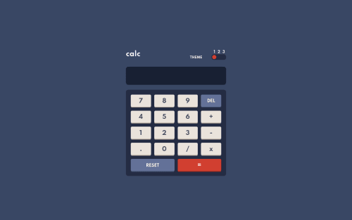
Design comparison
Solution retrospective
I would like to know how to improve my code and if in this case the use of eval is good or not
Community feedback
- @pikapikamartPosted over 3 years ago
Hey, good work on this. Layout seems good in desktop and mobile, and it scales when the screen is small. Functionality also works so another good work for that.
About your question. I personally doesn't like using
eval
function in any languages since it can take any valid code. Meaning, if a user for example entered a valid code that can somehow cause an error, bug , your program will read that and it can cause unwanted things right. That is why refrain from usingeval
. Though on this one, since it is only inputting numbers, it can pass of? But still, do not use it. I'm not saying eval is bad, the users are the bad ones:>Some suggestions would be:
- Your solutions really lacks accessibility. You didn't use any interactive elements like
button
input
. The theme togglers could be radio buttons since colormodes are selections of themes right and radio buttons are used for selections, it will be really good to use it. Wrapping it insidefieldset
along with thelegend
- The numbers could be really
button
in here so that there will be native keyboard accessibility, you can use tabs on keyboard to navigate and choose numbers. - Inspecting your website from dev tools at the bottom, your layout changes because you are using
height: 100%
on the.calculator
selector. So when the browser's height changes, for example, goes smaller, theheight
of the calculator will be small as well. Instead, you can just explicitly define theheight
to beheight: 580px
on the.calculator
selector. Then on thebody
tag, remove theheight: 100%
declaration, it is a bad practice to useheight: 100%
orheight: 100vh
on thebody
tag or any other container that contains a large content.min-height: 100vh%
will be more beneficial and great, so apply that to thebody
tag. Then add some paddings to the top and bottom on thebody
as well.
Still, good job on this one. But consider using more appropriate elements for other challenges to make it the structure more semantic.
Marked as helpful1@VILLALBA-22Posted over 3 years ago@pikamart Thanks man, I had not considered the buttons as input and the height which could have a minimum.
0 - Your solutions really lacks accessibility. You didn't use any interactive elements like
Please log in to post a comment
Log in with GitHubJoin our Discord community
Join thousands of Frontend Mentor community members taking the challenges, sharing resources, helping each other, and chatting about all things front-end!
Join our Discord